
interview: Andrew Ordonez

Andrew Ordonez is an artist living and working in Kansas City, Missouri. He is a current resident of The Drugstore, a communal and collaborative studio space for artists located in Kansas City’s historic Katz Drugstore. Among many themes, his work explores geographical time capsules, artifacts, and urban debris within the context of history, heritage, and queer culture. He primarily works in photo media, painting, sculpture and décollage. We caught up with Ordonez after the Young Latinx Artists 23 exhibition at Austin’s Mexic-Arte Museum, where his work was on display, to talk about migration, fragility, and symbolism in his recent work.
Tell me a little about yourself. Where did you grow up?
AO: I was born in Fort Worth, Texas, in 1991. My family came from North Side, Fort Worth, and what was really special for me is that my grandparents lived right next door. So I was raised in between these two houses that together was one extended home. Most of my earliest memories are in Fort Worth making flour tortillas with my grandma or going junking with my grandpa.
In 1995, my family moved to Arlington, Texas. I grew up in Arlington from ’95-’09, with a goal to study art somewhere that had more opportunity and more challenge than from what I knew in my immediate surrounds. I accepted a scholarship to the Kansas City Art Institute (KCAI) and started in the fall of 2009.
What did you study, and how does your education influence the work you create? Did KCAI encourage mixed media and 3D works, or were they an act of experimentation?
AO: I started in the painting department in my sophomore year. The painting department faculty at KCAI shaped my perspective on how far “painting” stretched through material. There’s a broad approach on how paintings are made and an even broader approach on how you talk about painting. I didn’t use cement material until after I graduated, but a lot of the work I created spoke toward architecture and artifact. Paint itself acted as a vehicle to get to other 3D materials that I was interested in working with.
Let’s talk about your use of concrete. How did you come to use this material, and how do you go about creating slabs?
AO: I started with a project that eventually transformed into a billboard display at the gallery 50/50/KC. At the time I was cutting up recycled Spanish language textbook pages and collaging the scraps onto a corrugated foam core surface. I became fascinated by how the images overlapped on the surface of the zig-zagged substrate, so I decided that it might be interesting to flood the substrate with a material that would distort sections of the Spanish textbook pages. I also wanted to keep the striation of the folded panels and thought that using cement would also speak to corrugated surfaces of ancient Mexican monuments but also common debris. The slab ended up breaking into two pieces, but it taught me a lot about pouring cement and concrete. This began my interest in containing photographs, sculptures, and materials within the slabs.
Oh wow. I would not have made the connection to the Mexican monuments, but I can definitely see the common debris. That is an interesting juxtaposition! What draws you to the aesthetic of detritus?
AO: I am really interested in objects and subjects that contextualize history and time. I recently had an exhibition at Front/Space gallery in Kansas City that defined the sculptures and slabs in the exhibition as time capsules. So that stuck with me. A lot of the work that I have been creating within the last year references my memories living in Fort Worth in the early 1990s. Preserving these memories sort of operated as a time capsule I wanted to examine. Detritus is big because there are so many once-preserved or beloved objects that then become mismatched and abandoned. I think that is where a lot of the work conveys an impression of detritus. In a way, I am sorting from abandoned goods that speak to specific memory of my upbringing in North Side, and at times Arlington.

Luggage & Luggage II (2017). Archival print, metal rods in concrete.
We loved your work in the YLA 23 show at the Mexic-Arte. How did you come up with the concept for Luggage?
AO: Thanks! The beginning of the suitcase luggage also started with collaging fragments from the Spanish textbook pages. I came across a lesson plan in the textbook that translated travel vocabulary such as avión, pasaporte, y equipaje. The collage consisted of denim button-up shirts and khaki pants scattered across sections of an airport. I incorporated drips of paint across the imagery to contain and organize certain garments and figures. I photographed the collage and kept the archival print in my flat file for two years. Within the last year, I had decided that I wanted to conjoin the collage works and archives with the cement tomb and slabs I was constructing in my studio. I gather a lot of objects, some from personal keepsake belongings and some that are strictly industrial. In my studio I have gathered a lot of metal piping rods that I attached together to suggest or to imply a handle on a rolling suitcase bag. At first glance, the sculptures act like minuscule and ordinary fragments of an industrial or architectural construction site. The title Luggage is so important because it allows the viewer to experience the duality of the sculptures. I thought about the relationship of each sculpture to the current events of the time they were built. The sculpture on the left side of the installation responded a lot to the travel ban of 2017, while the broader sculpture on the right responded to the immigration crisis of 2018.
Have you traveled often in your life? How does travel factor into your own history?
AO: I have traveled quite a bit across the United States. I have some travel experience in Mexico and would love to continue exploring Mexico within the upcoming year. I am fascinated with my family’s travel history both in Texas and in Mexico. A lot of the work speaks to stories I have been told through the years or from my family. The Luggage sculptures were great to work on because they allowed me to recognize how travel played a role in my studio practice. The context of the sculptures I create speak a lot to time travel, so it’s great to pair that context through actual geographical travel.
In the United States, I traveled consistently for work from 2013 to 2017. I worked as an admissions counselor for KCAI and visited around 20 states throughout my tenure. I absorbed a lot of culture throughout my travels. Aside from my job duties and responsibilities, I made it a mission to search the natural wonders of each city. I wanted to discover the historical and cultural personality of each city while snapping photographs and collecting small souvenirs to later alter or re-examine in my personal studio. A lot of the work spoke to what it meant to be a stranger within a familiar land, as I was alone for a majority of these trips. I still have a lot of footage and undeveloped film that I would love to use for future projects.
That is so cool. I would love to see how you incorporate the cultures of different cities into your work. Do you have an idea of what that might look like?
AO: It is interesting because at times I feel that I am just as drawn to the similarities and relationships cities have to each other as I am to the differences. For me, I’m reminded how cities work from the context of the other cities, or other versions of a grid system. I am curious to piece some of this footage together to examine where these cultures collide versus where they inhabit. I am also interested in the context of land and nature versus how a space advertises its own entertainment culture. That’s something I noticed from traveling across America.
Speaking of travel, your work is especially poignant in light of recent news that Latinx citizens are having their passports revoked. We are seeing Americans have their citizenship erased. The concrete suitcase is emblematic of this tension—the idea that immigrants travel to come here, yet they are now being stripped of that very freedom of movement. It also illustrates the difficulty of immigration. To many, there is this idea that it’s so easy to come here, when in reality, it’s tremendously difficult. It’s life changing. To suggest that someone can just up and move to another country is insane.
AO: It is. Rocha Rochelli curated an incredible show. I was extremely honored to be included with the other artists, and a lot of the other works gave a context on how to view my sculptures. Collectively, all of the works in the exhibition carried, mourned, and respected that tension you described. I felt very honored to hear profound, personal, and at times devastating stories from the other artists at the artist talk we held the day after the opening. For me, the work paid homage to my ancestry: I wanted to pair these two suitcases together almost as a flirtatious couple, one representing the immigration stories I have heard through my paternal family history, and one representing the immigration stories I have heard through my maternal family history. I feel many Latinx individuals can relate to the desire and struggle of piecing together your family lineage, a lot of which seems too scattered and buried between the acts of geographical dislocation and oppression.
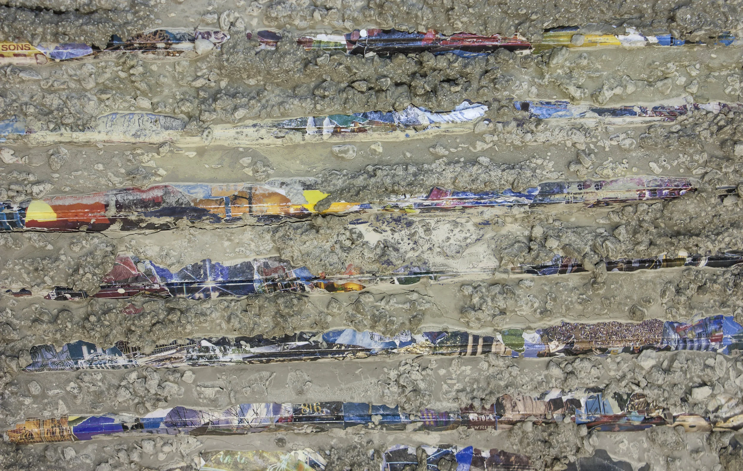
Density #2 (2017). Archival print of concrete on corrugated collage.
What are the images plastered onto the concrete of Luggage? Why were they chosen?
AO: In the second suitcase, I used another archival print that features a digital erasure of a photograph that I took of a fax machine. Even when the print is not buried under 40 pounds of cement compound, the photograph isn’t very discernible and doesn’t give many clues to the viewer. But I found that its formal aesthetic—erased marks across a document—contributed a lot to the themes surrounding the luggage. There are specific objects and miscellaneous objects hidden within both objects. If you look closely you may find anything from scattered debris of haystack to coin pesos, broken tree limbs, newspapers and street findings.
You’ve said that your work speaks to fragility, which I think is a fantastic and unexpected theme to approach with this material. Concrete is just about as far from fragile as you can get. How do you see these works as demonstrating fragility? What sort of fragility are you exploring?
AO: In critiques I have been told that these works are highly emotional and sensitive forms. They seem to appear as decaying tombs, a fractured system, or small, mundane, ordinary street debris. Working with Rocha Rochelli and the Mexic-Arte staff, we decided that the installation would benefit from crumbs of cement dust sprinkled around the surface of the gallery pedestal. Quite literally, these works are more fragile than they appear. The surface is cracking; small fractions of the gestalt are revealing and crumbling into dust. I hope that the nature of the crack and dust offers the impression of ancient Mexican artifacts, while also speaking to the detritus we talked about previously. Other times, I have been told there is some odd and bizarre humor in how fragile and deconstructive these cement blocks are. I think about what it was like to actually travel with these pieces down to Austin, carefully placing them in the trunk of my car next to the cushion of my actual luggage. Then I consider what it would be like to actually travel with these through airport terminals, even imagining a scenario where these are carry-on items that go through TSA pre-check. I’d be fascinated to see what one of these blocks might look like through the x-ray baggage scanner.
Tell me about your other piece from the YLA show, Amyl Emoji. How did you approach its construction? The striation of the concrete and the temporary tattoos—what is their significance?
AO: The slab for Amyl Emoji was actually that first slab that I had built that broke into two pieces. Again, I liked the duality of two parts of one’s heritage and felt that the cracked divide in the center of the slab responded to the Luggage pair in more of a parody manner. Language has always been interesting to me, especially fragments of ideograms and symbols. Spanish to English translation is even more personal to me because I am not exactly fluent in the Spanish language, which has naturally brought feelings of shame and setback throughout my upbringing. I wanted to communicate in a universal language and by doing so formally reflect on the pattern and rhythm of the situation. These emoji stickers resolved that for me. It felt adrift, like an aimless scrap you’d find on the side of a fence or house. It felt innocent in ways, departed in other ways. Also, its versatile and playful approach felt a little familiar to queer culture.
I also really responded to the pairing of the temporary tattoos on the surface of the cement. A lot of times, I received feedback that the object resembles a kind of embossed air conditioner vent. As a child, I remember decorating our air vent with Disney stickers and scribbling with crayons, so it felt oddly familiar to consider temporary animal and smiley-face tattoos as a collage adhesive. As I arranged the tattoo stickers, I was drawing inspiration from my previous capsule series and decided to arrange the adhesives in the form on a horizontal capsule.
What is the meaning of the title?
AO: The title felt a little risqué to me because Amyl refers to amyl nitrite, the chemical found in the inhalants poppers. I am interested in this as a way to explore queer cultural commodity, as amyl nitrite has been seen in gay culture from the latter half of the 20th century to the present. This work transforms quite a bit for me. As it ages, I perceive it with a different narrative twist. The surface becomes more of a tablet that allowed me to experiment with different interpretations.

Amyl Emoji (2017). Temporary tattoos, concrete.
Ah. I did note that you mentioned that these pieces convey a “spectrum of queer culture.” Can you elaborate upon that a little more?
AO: I think a lot about Gilbert Baker’s first flags he created around 40 years ago. Before the pride flag became a symbolic and sometimes corporate trademark, it was an art object sewed together by an artist in a studio. For me, as a gay artist, it really set a precedent of symbolic duty. It’s the ultimate spectrum, as the colors literally represent multiple aspects of human necessity, i.e., sex, life, healing, sunlight, nature, magic, serenity, spirit. It’s really inspiring that this original 1978 work of art represented that many aspects of meaning, symbolism, and identity. It might seem odd because, formally, this bright, vivid, striped, rainbow-colored fabric could be seen as somewhat distant from brutalist cement sculptures with metal rods protruding outward, but I hope to approach my work with as many symbolic and fluid concepts as this flag.
I think a lot about feminine approaches to masculine objects, and vice versa. I attempt to discover relationship between industrial objects and the male form. With my latest work, I broadly think about fashion as it conjoins to architecture and interior space, and as it refers to history and politics. There are a lot of themes in making sculptural handbags and suitcases that I enjoy exploring in the work, such as navigation, necessity, identity, communication and perhaps even mortality.
Tell me about some of your other slabs. They are all so interesting and inscrutable. How did you choose the imagery for NEED U and Vaqueros?
AO: Both of these works are about my experiences in New Mexico. The photograph slicings in NEED U are from signage that I came across in Albuquerque, and the cut tile forms pasted across Vaqueros are snapshots of a shirtless cowboy poster I documented in Santa Fe. After editing the photographs, I decided to print these images on custom temporary tattoo adhesive, then take a blade to slice them into new shapes. I pasted them on concrete slabs I built almost as if it was a process of mapping out my experience in New Mexico. Back In 2009 I went on a road trip to Santa Fe with my poetry mentor Jim Benton on his Ways of Seeing tour. Since then, I have been drawn to New Mexico’s meditative atmosphere, and I find its energy in a lot of the work I create.
What is For Your Eyes Only? I love the cover images that you put together for it.
AO: Thanks! For Your Eyes Only is a zine in Kansas City created by Mac Atkins. It’s a side collaborative project from the team at Electrosexual, a series of alternative dance parties for LGBTQIA+ individuals in Kansas City. I designed the front and back cover of the second issue of For Your Eyes Only and titled the work May Issue. My interpretation of the prompt considers what queer connections LGBTQIA+ individuals may take for granted in today’s digital age.
The digital/physical collage uses segments and snippets from vintage adult queer erotica magazines, specifically from the resources pages in the magazine. In a pre-Internet age, these editorials were important sources of information to spread awareness of community and connection. These resources may have included private resorts, purchasing erotica, or perhaps coordinating dates in person or via phone. The collage considers that these messages are intimate, sacred, private and important to find a connection in the physical world.
I’m also curious about the consumer aspect of those resources. Do these advertisements use seductive or tantalizing measures to sell their own product, the magazine itself? Has anything changed from 1980 compared to 2018 in those regards (i.e., Grindr selling clothes or becoming increasingly more retail-focused)?
The collage stands in as a relic of queer past by its appearance of fadedness and fragmentation, as the text is abbreviated, erased, and muted. I’m interested in the use of memory and language in queer spaces, however discombobulated that may be.

Capsules (2016). Installation shot, Kiosk Gallery. Scanned, faxed, and collaged drawings on photo paper.
Looking at some of your older work, it seems that you used to work more with paper, recreating the same effects of age and wear that you achieve with crumbling concrete via scanning, faxing, and collage. Can you tell me about the Capsule series, and what you were hoping to achieve with those works?
AO: I looked a lot in mapmaking, specifically world atlas maps. In fact, a lot of the collage scraps I was using spoke to geography in some way. I was using the Spanish textbook pages and also collage snippets that I had cut up from dinosaur coloring books. I thought I would pay a slight nod to those themes, and I found it interesting that excerpts from Latin American translation felt so geographically specific, but Jurassic creatures obtaining the earth felt globally broad. Either way, I found it interesting to distort the imagery then arrange 8½ x 11 sheets of paper in ordered rows. It became a very meticulous process, because each printed sheet went through an extensive collage, paint, scan, copy, digitize, print, embellish, copy, reprint-then-adhere process.
I would slice a section on photo paper off the top of the sheet that I would feed into the fax machine. That would be the only way the fax machine would print on high quality printing paper, because it registered that the slice cut from the top of the sheet was lightweight printing paper. It was almost like tricking a kid to eat their vegetables with an airplane spoon. This had a lot of meaning to me, because there was so much analogue in the technology I was using, and I wanted to convey an abundance of texture through 2D. I felt like the capsules created a shift somewhere between stereograms and atlas abstractions. They’re great to reflect upon, especially now that I’m pulling from physical texture and physical detritus within these new capsules.
Did you feel at some point that you needed to move away from paper into more industrial materials? What other materials do you hope to work with?
AO: I hope to incorporate the two together through more installation. They work hand in hand because in some instances I’m more interested in presenting digital documentation of photographic-infused slabs. That’s where a lot of the collage practices come into play. Embossing the photographs into the cement slabs, I thought a lot about image and object relationship and then realized that the materials I wanted to use were really endless. A lot of times I think more about the objects as buried objects rather than what specific objects they are. If I am considering using a material, I always think about if the objects can be recognized as site-specific, and to what site or to what burial.
What do you have planned for your next offering?
AO: At the moment I have been focused on building cement handbags. These are similar to Luggage but they allow me to work with more embellished surfaces and patterns. A little bit more subdued, these new handbags have allowed me to incorporate the shapes of embedded objects I have been working with. I’m deconstructing material such as fabric, plastics, yarn, thread and, again, photographs that imprint onto the surface of the stone, rather than protruding outward. Along with fabric patterns from manufactured handbags, I incorporated the shape of Halloween skeleton decorations buried within the fabrics. And that’s just one example. There are so many ways to incorporate objects into these cement-mount forms.
Interview by Ivan Alonso and Sean Redmond.
Photography by Andrew Ordonez, Elizabeth Campos (Luggage), and Erin Dodson (Capsules).